

 |
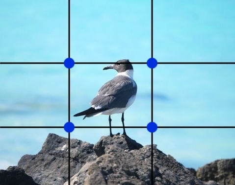
| In this photo, I photographed the seagull at the center of the shot. It's an ok picture, but it doesn't tell a story and seems rather flat and stagnant. |

Negative space is useful when photographing moving (or in this case soon to be moving) subjects. Leaving space to show the direction that they're moving in creates a better shot.
When shooting a single object, aligning it towards the bottom left corner of the frame will give your subject added focus in the photo. Multiple objects can be positioned towards the bottom right side for a similar effect.

Balance in a photo can be obtained by means of: symmetrical and asymmetrical balance. Wait!! Don't change the channel just yet! It's pretty easy to understand. Let's look at some photos to explain the concept.
 |
| The cars in the photo are evenly balanced showing symmetrical balance.
The buses are of different size yet, the smaller bus balances the larger bus in this photo.
|
A correctly balanced photo allows the viewer to take in the full story of the scene. Objects that are identical or similar are placed side by side to achieve symmetrical balance. Objects of different size are positioned on opposite sides.
 |
| Symmetrical Balance |
 |
| Asymmetrical Balance is achieved here by the use of color and the balance of objects in the foreground, middle-ground and background.
Balance can also be obtained by color. In the photo above, the two red cars balance each other. Rich vibrant colors can also be balanced by muted or more neural tones, they don't have to be the same color or saturation. How dark or light a subject is also affects balance. When shooting a dark subject, placing it before a light background balances the shot. A light object on a dark background will have the same effect.
Radial balance is another simple aspect of balance. It is seen in objects where everything is assembled or radiates around a central point. Staircases, flowers, bicycle wheels etc. are a few examples of radial balance.
|
 |
| Radial Balance |

There are three types of lines (sometimes referred to as leading lines) to experiment with when composing your shot: vertical, horizontal, curved and diagonal. They all add different effects to your photo, however diagonal lines tend to have a bolder effect. Lines can be used to pull the reader into and through a scene or to direct their eyes to the subject of your photo. Here are a few examples:
 |
| Horizontal lines draw the eyes into the scene. |
 |
| Horizontal lines also have a calming effect. |
 |
| The roadway in this shot takes the eyes through the scene. The vertical trees give the appearance of height and grandeur. |
 |
| Vertical lines can also show growth. |
 |
| Diagonal lines give the appearance of motion and energy. |
 |
| Graceful S-curve |

As I write about this technique I can't help but think about Madonna's "Vogue" video where she frames her face with her hands. If you don't remember it, check out the video again. Framing in photography works a bit like that because it compels the eyes to focus in on the object being framed. Frames can pretty much be anything on the edges of your shot. It can completely surround the subject like a window, hole or archway, or it could be something that frames one or two...maybe three edges of your scene. Here are a few examples of framing. Let's see how they impact each photo.
 |
| The framing of the trees on both sides of the photo draws attention to the subject and gives depth to the scene. |
 |
| The window frames the subject giving it prominence in the photo. |
 |
| Your eyes are drawn to the boat because of its framing. |
 |
| This arch provides a great frame for the green door |
 |
| Trees provide a great frame for the lake scene here. |
Windows, doorways, arches, holes, bridges, people, trees (you get the idea) can all be used to frame your photo.

Make sure that the subject you are framing is in focus and that it is exposed correctly.

Make sure that the subject you are framing is in focus and that it is exposed correctly.


As you look at the above photo, is there any doubt as to what the subject is? Before pressing that shutter release button, you have to make decisions each time as to what the subject of your photo is and utilize techniques to make it stand out to the viewer. We've discussed a few of these already, framing, using lines and the rule of thirds, and now a few more to add to your camera bag of tricks!
In the photo above, I used a combination of the rule of thirds and depth of field. I'm sure you picked up on that. Great! Blurring the background removes unwanted distractions and places emphasis on your subject.

Your subject will have even more presence if you keep it simple by zeroing in on it and disregarding anything that takes away the impact of the shot. I love the simplicity of this shot and how the boat is center stage.

The use of color contrasts is another way to make your subject "pop" in a photo. Contrasts can be made with colors that are complimentary (like the photo above) as well as with contrasting colors ex. orange and red. Other contrasts between dark and light, new and old, soft and hard are also useful as well.

Fill the frame with your subject. The viewer will have no choice but to pay attention to your point of interest.


To create depth in your shots, include elements in the foreground, middle ground, and background to give you a layered effect. Attempt to bring your foreground image closer to the lens and allow your background to fill out the background.

Photo editing software makes it easy to crop images you have already shot to obtain better composition in your photos. After doing research on this topic, I found myself reviewing older photos and cropping them based on these techniques. Not all photos will lend themselves to cropping, so remember these tips before you take that shot and you're on your way!

